I have a firm belief that it is important to have show posters if you’re in a band and you play shows. Whether you make them yourself, or you have someone make them for you, the show poster is a no-brainer low-hanging fruit promotional tool. The posters get displayed on the walls and windows of the venues. When people go to shows at those venues they see the posters. They see your name. And then they get huge boners because they know exactly when and where you are playing next.
Sometimes, when your poster is really cool, the venue will frame it and leave it on display long after the actual show. For example, if you’ve been to the Crocodile any time in the last 10 years you are sure to have seen this We Wrote the Book on Connectors poster (design by Travis Young) hanging on the wall in the stairwell.

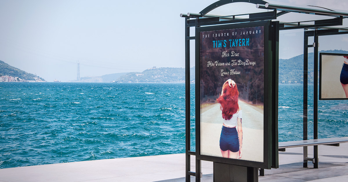
The nice thing about playing so many shows as of late is that I get the opportunity to flex my poster design skills. The next Mike Votava and the Ding Dongs show is on January 4th at Tim’s Tavern (You should go! RSVP on Facebook here).
Here is the poster I designed. I’m a little biased, but I would file this one under “G” for “Good One”.

Hubba hubba! My posters are not ever this hawt! It was fun to go outside of what I might normally do.
The original photo was taken by Pedro Sandri. He was kind enough to publish it on pexels.com, making it free for anyone to use. Thanks, Pedro! I think it’s an amazing photo. So much potential story behind it. Why is the lady walking alone down the middle of the road? Where did she come from? Why did she leave? Where is she going? How did she get such awesome hair?

Photo by Pedro Sandrini from Pexels
I took it upon myself to make some modifications. I wanted to make it a bit more “artsy fartsy”. I gave it an low-resolution textured look, added some “painting-like” effects that zapped out a lot of the details, and oversaturated the colors.

The other major change I made is I painted in the entire horizon with the trees that are on the edges of the original photo. I needed a higher contrast background that the text could sit on (there’s nothing worse than a show poster you can’t read). By doing so I transformed the background into a giant smoke cloud of terror.
That created a whole new story. Why is this woman walking towards the gloomy doom? I imagine a scenario that she’s not walking towards it. She’s actually walking away but she pauses a moment to look back towards where she just came from.
The last thing I want to talk about is the type.
I used a vintage style font family for the font called Breakdance (what a cool name for a font). The cool thing about this font is that it comes in both a regular and a script style. You can see both styles on this poster.
Instead of listing the show date like a typical normal idiot designer might, I went with the more stylized “The Fourth of January”. Paying tribute to my favorite holiday “The Fourth of July”.

If you like the poster, good news! If you come to the show on The Fourth of January at Tim’s Tavern I will give you a free 11 x 17 print for FREE.
Hope to see you at the show.
The end!