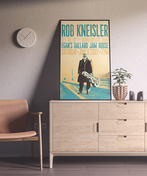
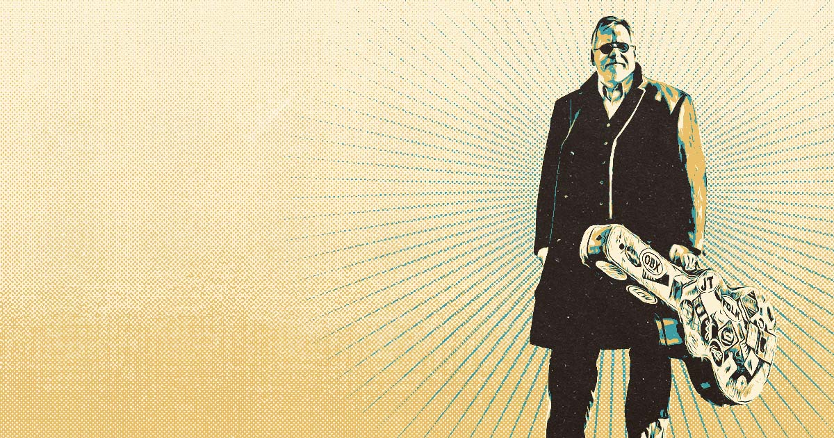
I was commissioned by Seattle artist Rob Kneisler to design a poster for his upcoming show. This is not my first time working with Rob. A few years ago he hired me to create the artwork and packaging design for his album Lift Me Up.
Here is the poster I made.
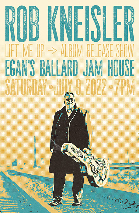
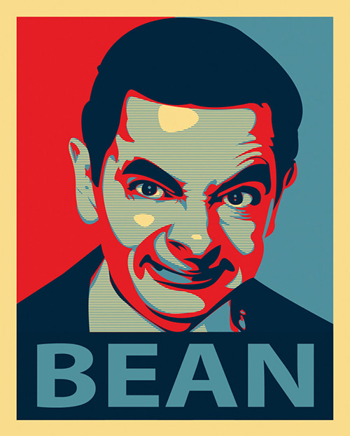
I’ve been into the minimal color vintage vector look lately. This project was a good opportunity to dig into that a little bit. This design only uses 4 colors and I mapped them to do different shading values.
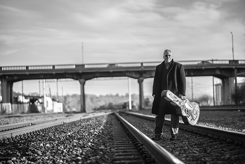
Here is the original photo before I added the effects. (photo by Ailisa Newhall)
This effect is similar to what is happening on the famous Obama Hope campaign artwork.
In the Mr. Bean piece below. Notice how the artist only uses four-colors. Look around you!
I think the poster I designed turned out pretty pretty pretty good. And I’m looking forward to using this style of effect in future projects. Word.

