Heyo!
I made an album recently with my merry band of ding dongs called Eat A Hot Dog. I am celebrating the release of that album with a big rock show on November 7th at Slim’s Last Chance. Nick Droz (one of three ding dongs in The Ding Dongs) made a new album of his own. We’ll be celebrating the release of that album as well. The show is billed as what is known in the biz as a “DOUBLE ALBUM RELEASE SHOW”. There will be sets from Mike Votava and The Ding Dongs, Nick Droz, and The Chris Poage Band.
But I got to be honest with you. Everybody knows that having a rock band, and making an album, and putting on rock shows is ultimately just a convoluted excuse to design a show poster. I did not let this opportunity go to waste. I made a goddamm amazing poster for this show.
Check it out. The first thing you will notice is how awesome it is. The second thing you will notice is how you can’t get over just how awesome it is. The third thing you will notice is that you are no longer capable of noticing things, this would include the fourth, fifth and sixth things that you might have noticed if you hadn’t already noticed the third thing.

I used a lot of unnecessary arrows that pointed at things. The orange one above the “nick droz” type points at Nick, and the blue one under the “mike votava” type points at me. I thought that was a good way for the viewers to know who was who (this is great because in general, nobody knows who we are). What I like is that those arrows add to the depth. They weave behind and in front of the benches, giving an extra dimension to an otherwise flat design.
For the typeface, I went with the Futura family. It’s pretty common. You see it a lot in big-budget Hollywood movie posters. Easy to read and provides an epic “feel”.When I was making this I thought the font choice was a little boring. I meant to “replace it later” but never got around to it. Sometimes I get lazier than I care to admit.
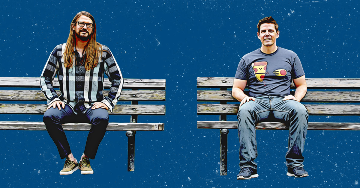
The photo of us sitting on the benches was taken by Rick Weber (one of three Ding Dongs in the Ding Dongs). For the poster, I cut out the original background and added a “comic booky painted” effect to Nick and I. It sucked out a lot of the detail but added some cool contrast.
Here is the original photo.

Here is the photo with the painted effect.

Here it is cut out from the background.

And here Nick and I are enjoying a baseball game.

Here we are on the moon about to be attacked by a giant astronaut monster.

Here we are on relaxing on the beach.

Here we are watching the greatest charity boxing match of all time, Thunderlips vs. Rocky Balboa. That was a good fight!

I printed out some extra posters. The prints turned out really good. The colors look great.
If you would like a printed poster, you can grab one at the show at Slim’s on Nov. 7th. I will give it to you for FREE.
Hope to see you at the show.
The end.

